Zusammen gegen Corona
/20

UX
UI
Management
Icons
Illustration
Client
Bundesministerium f. Gesundheit
Credits
Deepblue Networks AG
When
/20
What
Web portal
Have you ever shared an apartment with a colleague? I did! Exceptional circumstances require different collaborations. Within a day, my living room became a design office and bedroom simultaneously for my surprise roommate. We have taken on the challenge of developing a website for the Bundesministerium f. Gesundheit containing all the information available by then.
The situation
Cya in a few weeks
Probably most have had similar experiences of what it's like to change work environments from one day to the next and make the shift to home office indefinitely. But did you also get a new briefing an hour before? Our little task force did. Staying home. That's exactly what we were supposed to make a website for - as an extension of the upcoming campaign, to give people the focal point they need for information and at the same time prevent Fake News.
The challenge
From MVP to a fully functional website
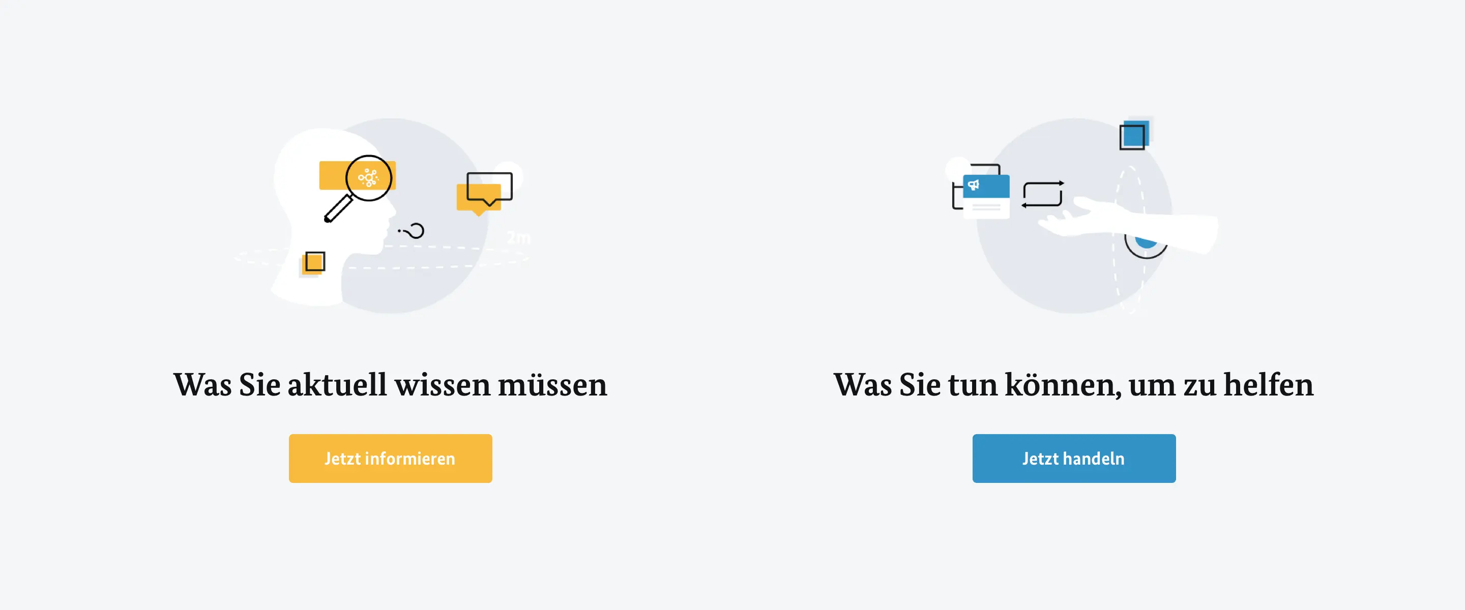
To be honest, it was tough to get started - no fonts, no design system or library to draw from. Information was pouring in through a variety of channels. There was only a vague target image - a website divided into "inform" and "act". That's what we took to heart and found our roles in no time. While the lines were running hot in the kitchen and wireframes were being scribbled, we started to build up a first library and pour initial thoughts into UI. And the result was quickly worth a look.
The solution
An ever growing portal
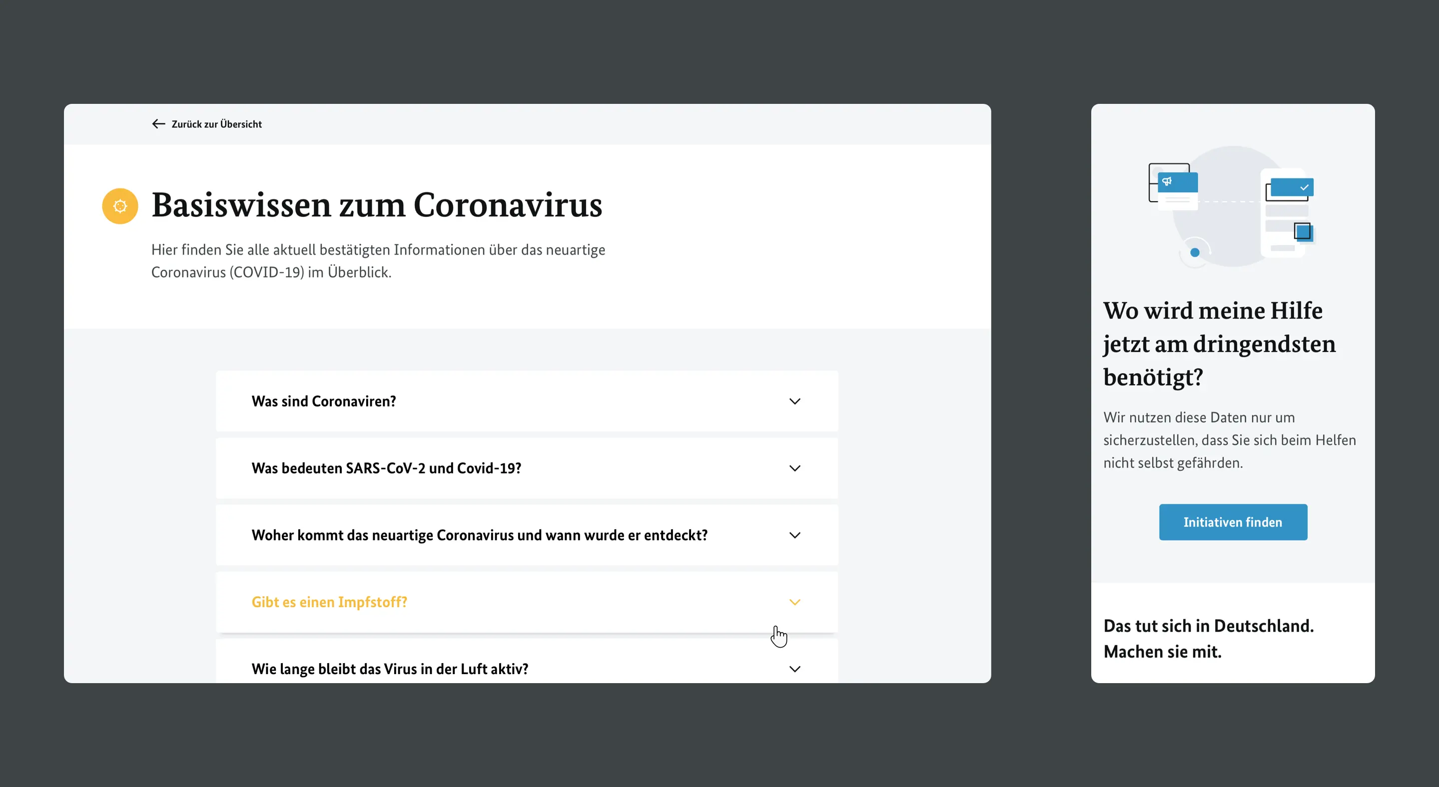
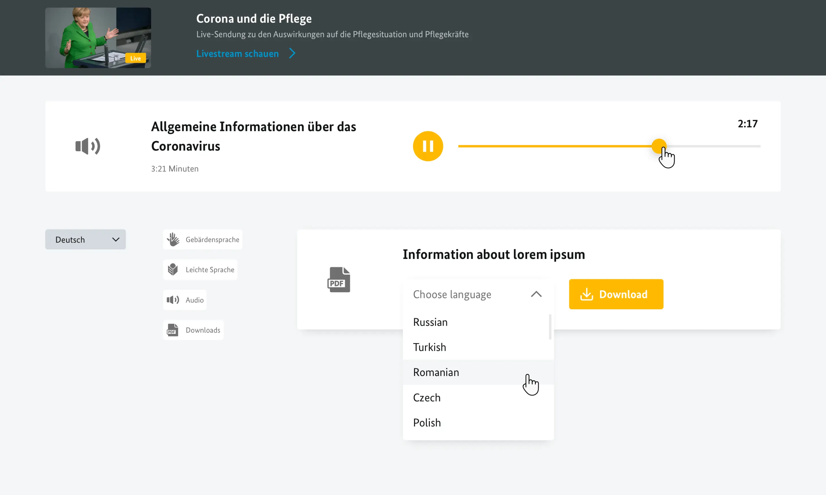
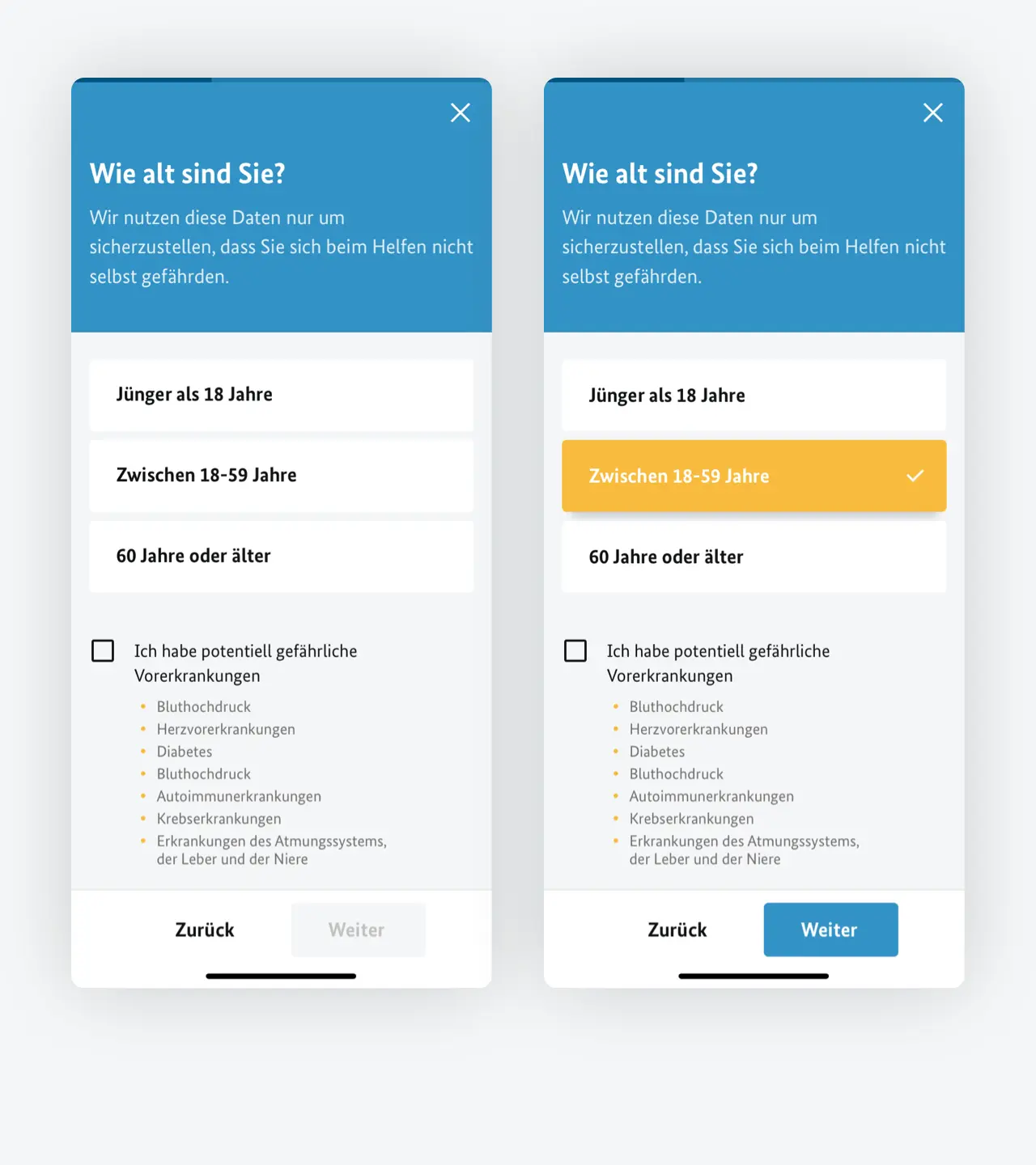
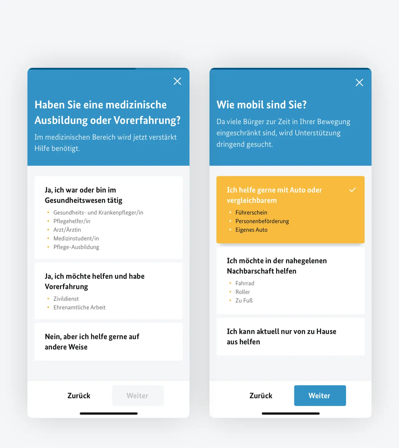
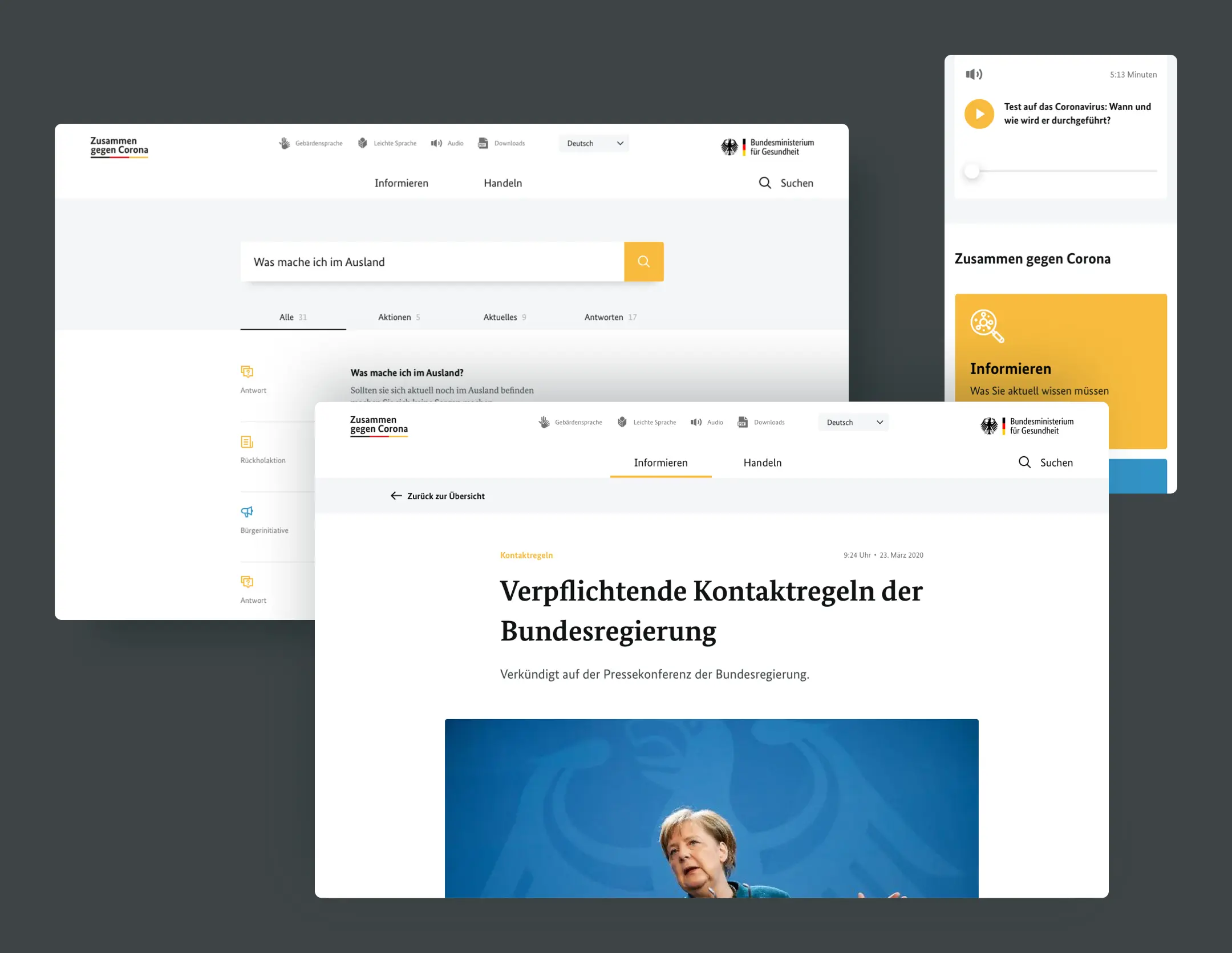
In no time we built a website that met the initial requirements. From briefing to launch only 52 hours passed. From that point on, the website was constantly evolving and no one could say what it would look like in the days to come. To enable users to become active, we provided a tool to find a suitable initiative. As the knowledge about the virus grew, the information section was also continuously expanded. This information was for everyone and should therefore be accessible to everyone.
My contribution
From factual to pretty
It is truly amazing to see what is possible to achieve – and that despite this short amount of time. As UI Lead, I significantly shaped the project and made conceptual decisions. The close collaboration as UI and UX team and the constant exchange with development made it happen. A great team, a great accomplishment and a good feeling to have contributed something to the prevailing situation!
Next project
Confidential
Room control
Proceed
