Room control
/23-24

UX
UI
UX Writing
User Research
Design System
Client
ASML · White Label
Credits
thingit
When
/23-24
What
Mobile app
In recent years, the work environment has undergone significant transformations. Driven by the pandemic, workplace dynamics have changed considerably. As remote work becomes more prevalent, the demand for smart office solutions has increased. Modern offices, utilizing booking systems and space analysis, are increasingly tech-driven. To save costs, some offices are now even built without physical switches for lighting and blinds. So, how do you try to compete with a switch?
Situation
Awareness and accessibility
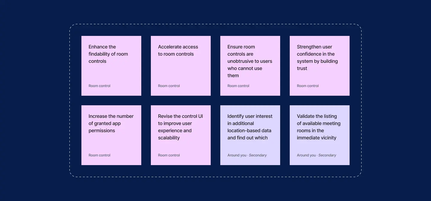
Room controls in the existing app were quite hidden - in fact, so much that many users simply weren't aware of them. Due to their generic group concept, accessing the proper controls was also very tedious. In the course of the new home screen and the contextual retrieval of app permissions, we had the chance to improve this significantly. The anticipated increase in authorizations for camera, location and Bluetooth could enable additional location-based services too. Which ones? That's what we had to validate.

Challenge
Quest for easy access
When working on the new solution, we faced several constraints and challenges. The new room control entry point had to be unobtrusive, as not all users could utilize the feature due to the unavailability of controls in some older buildings. However, employees frequently change buildings during their work day on bigger sites, making accurate localization of users within the building essential for providing the correct controls. Additionally, many employees do not have the mobile app installed, leaving them unable to change the lighting or temperature of their workspace. This highlighted the need to explore alternative solutions that do not require the app – but this had to wait.
Outcome · Around you
Exploration of ways to
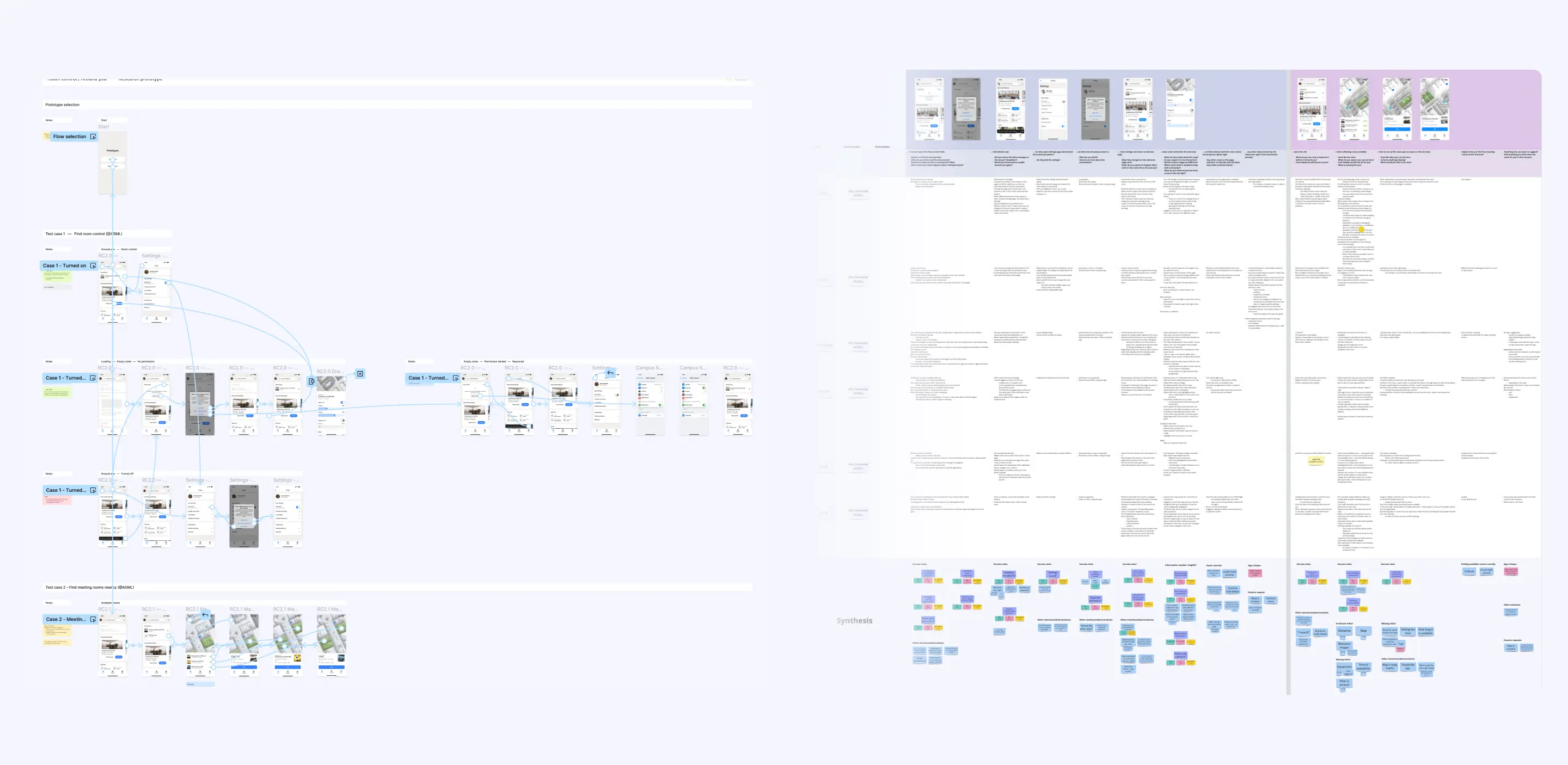
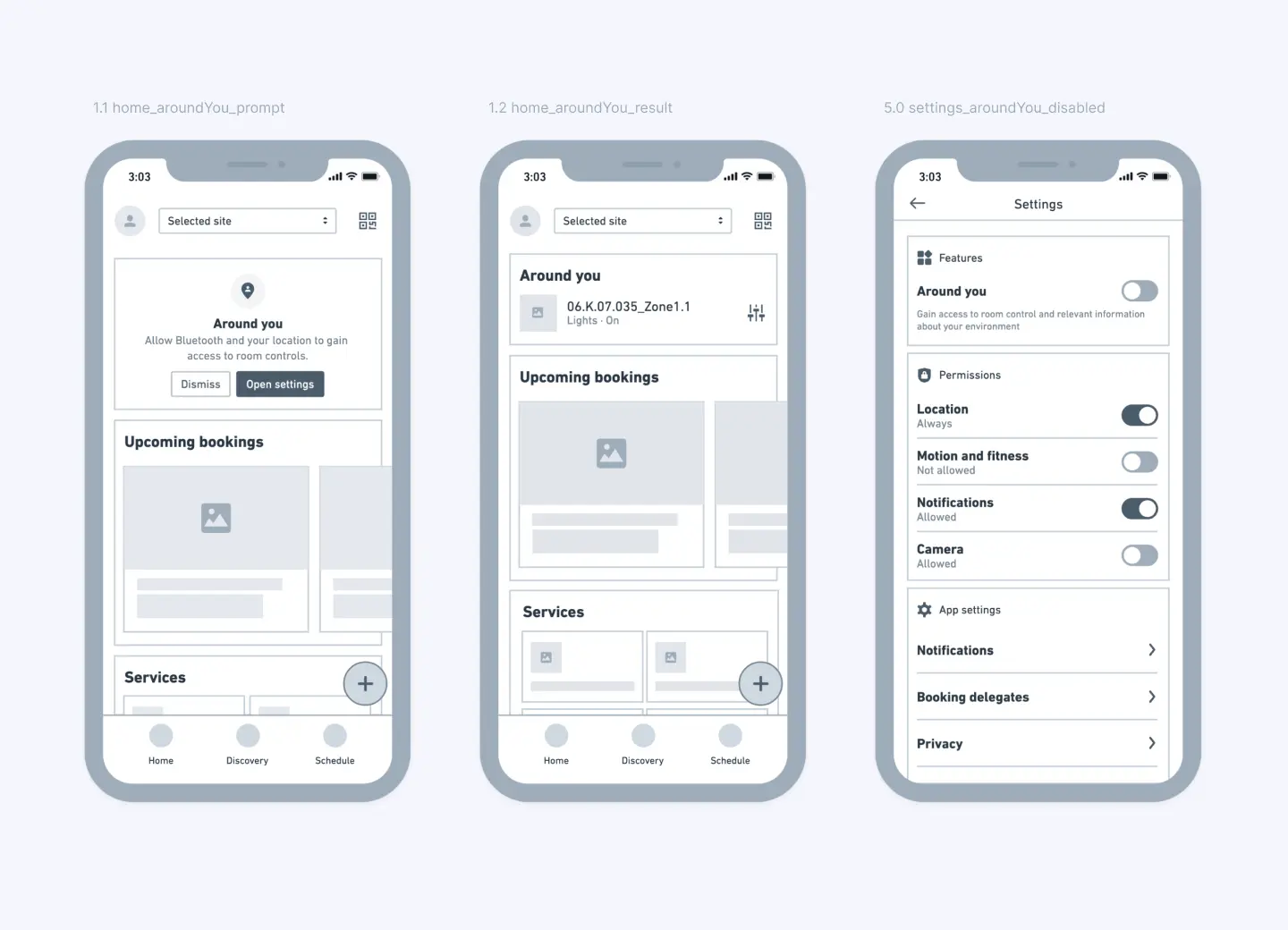
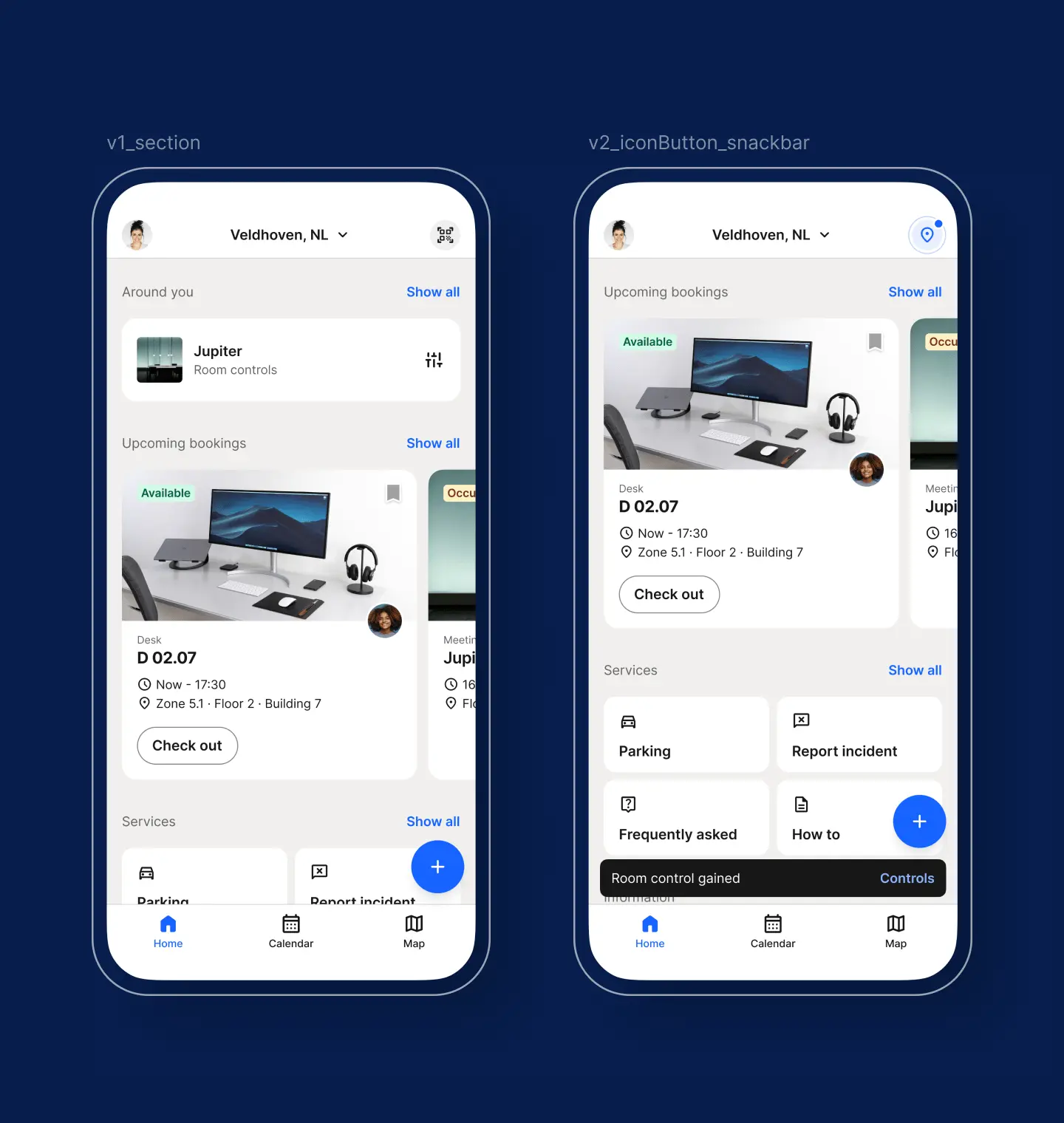
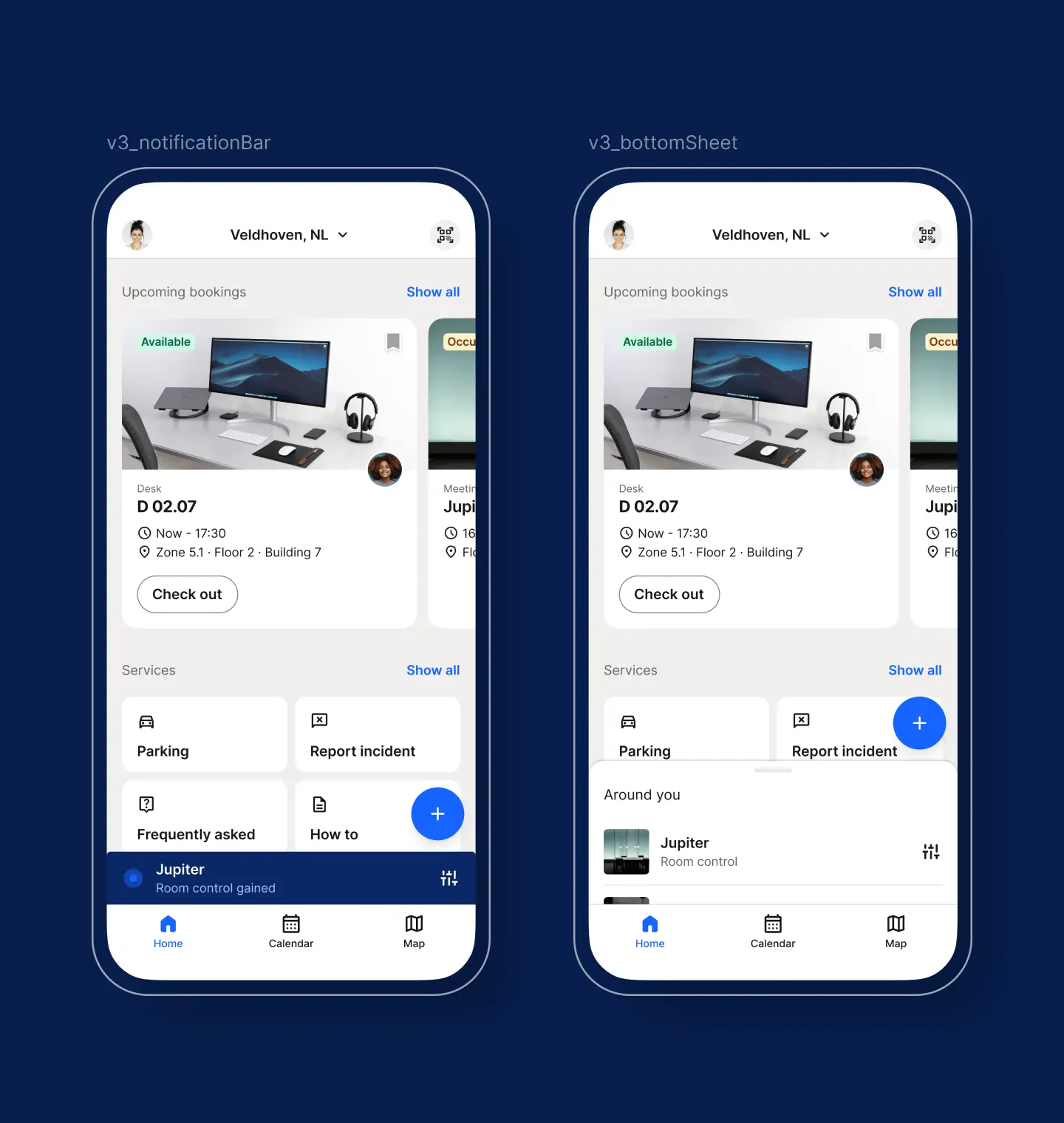
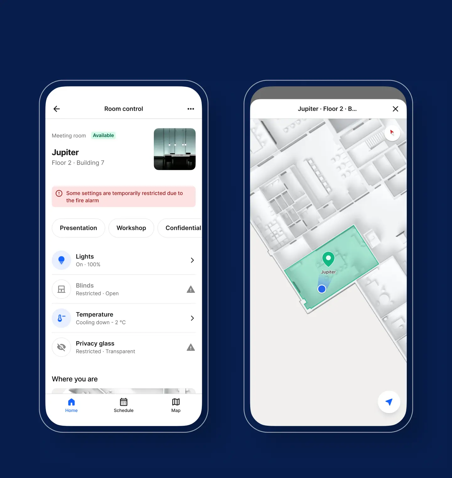
A major aspect of the new implementation was exploring ways to provide easy access to room controls. During this phase, the concept of ‘Around You’ emerged, even though it was initially unclear which location-based content users might prefer besides the controls. We aimed for a solution that could accommodate more content than just controls while ensuring that controls, as the primary use case, were quickly accessible. To validate our ideas and concepts, we conducted several moderated and unmoderated user tests, gathering both qualitative and quantitative insights. We tested multiple versions utilizing different UI patterns in A/B tests to determine which version performed best for accessing ‘Around You,’ with a particular focus on room controls. The outcome is a subtle entry point that doesn’t need to be disabled by users uninterested in the ‘Around You’ feature and allows for easy prompting and regaining of required app permissions. Additionally, our solution offers direct and easy access to room controls via temporary notifications.
Outcome · Control UI
Designing for scalability
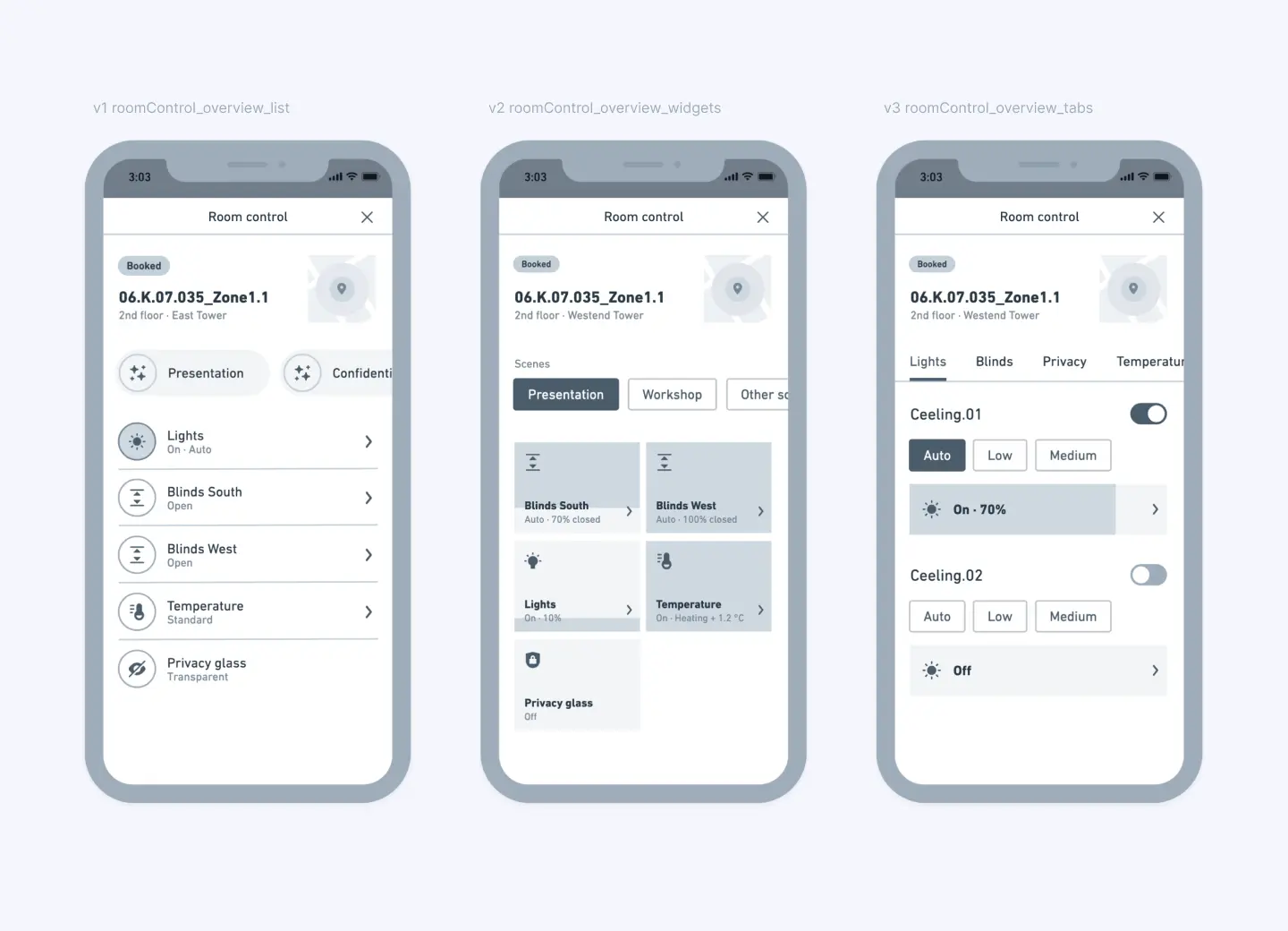
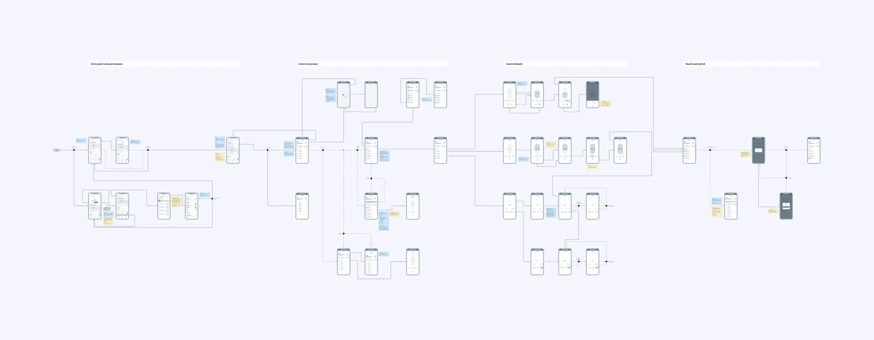
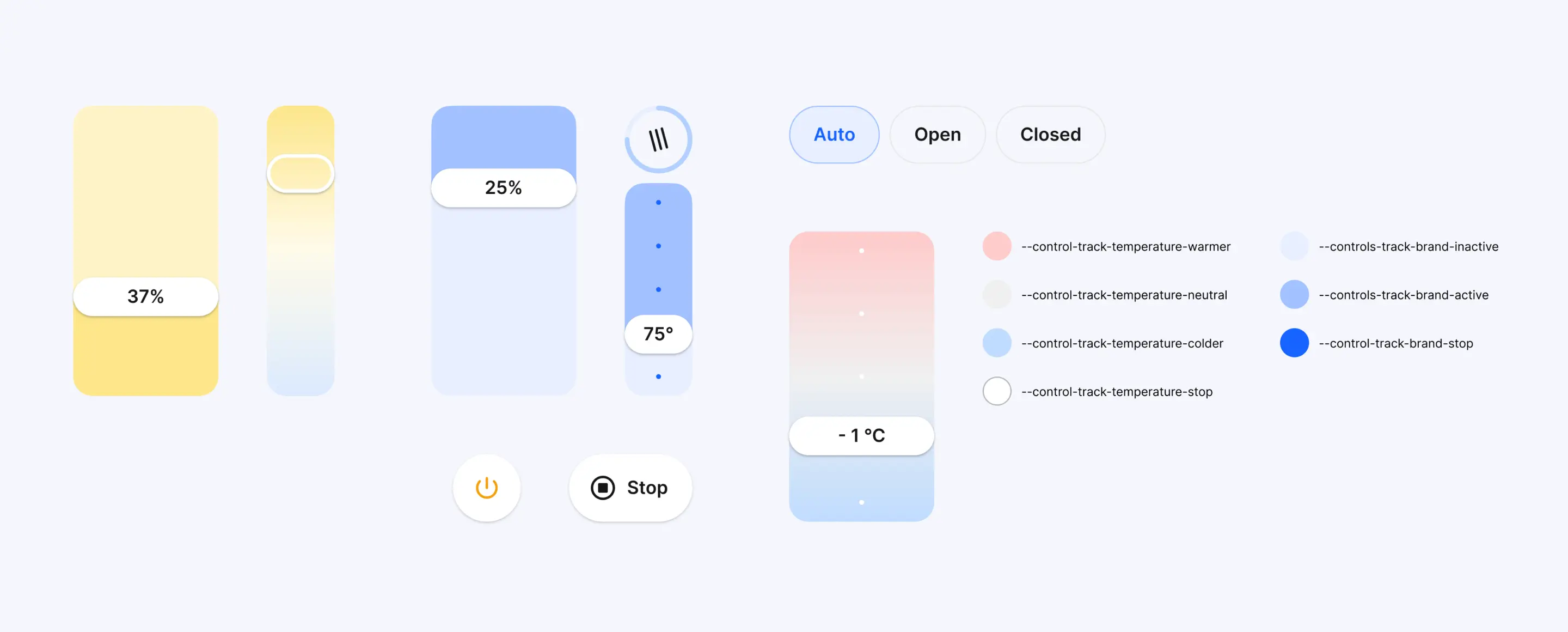
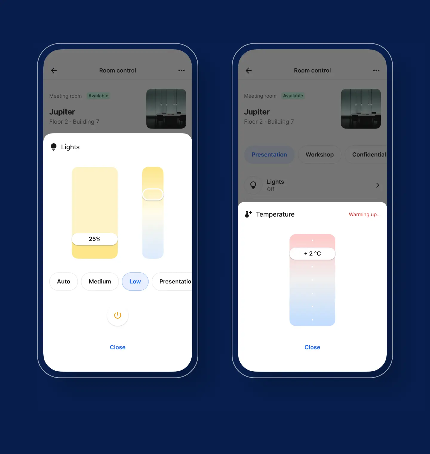
The existing room control UI displayed a lengthy list of temperature, blind, and light settings on a single screen, leading to extensive scrolling, especially for spaces with multiple adjustments. This resulted in a complicated and inconsistent UI, with each control having a unique interface. The new design needed to be generic to scale effectively, given the varying configurations from different manufacturers. By separating the control overview from the settings, we presented everything contextually at a glance. The new UI used components based on device configuration and was optimized for smaller company phones. This approach ensured an inclusive interface that accelerated functionalities, providing the best possible user experience to a wide audience.
Contribution
Navigating complexity
Being part of a client-funded team, my role as a Senior Product Designer involved strong collaboration with clients and other teams responsible for different parts of the app. Conducting both moderated and unmoderated user tests allowed me to validate concepts and prototypes, gaining valuable insights into additional user needs. Field testing on one of Europe’s largest sites provided me with a deeper understanding of the environment I was designing for and how the implemented infrastructure behaved in practice. Refining interactions and UI elements was integral to our iterative process, enabling us to deliver self-contained components across multiple app releases.
Next project
Check in be out
Proceed
