Beyond booking
/22-23

UX
UI
UX Writing
Concepts
User Research
Design System
Client
Deutsche Bahn AG
Credits
Mobimeo GmbH
When
/22-23
What
Mobile apps
In most cases, booking a service is not the end of the story - this is also the case for mobility. Where do I find my booking, how do I receive updates on it, how do I manage my subscriptions and where do I get an insight into the costs incurred?
The situation
How everything is connected
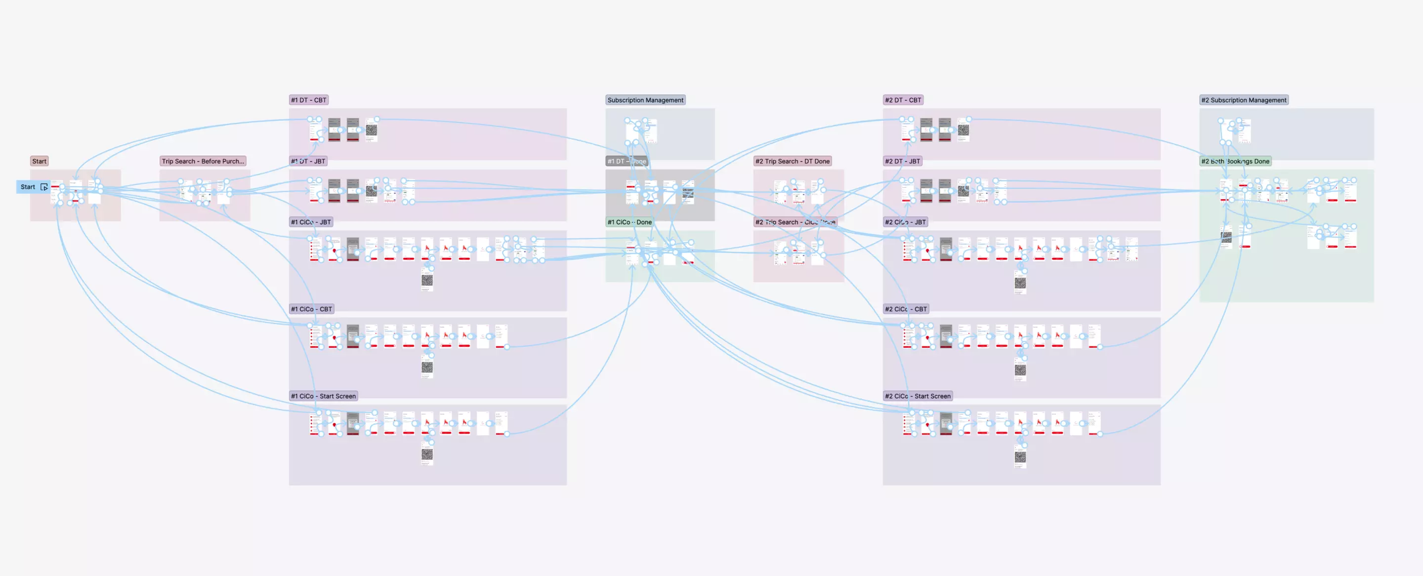
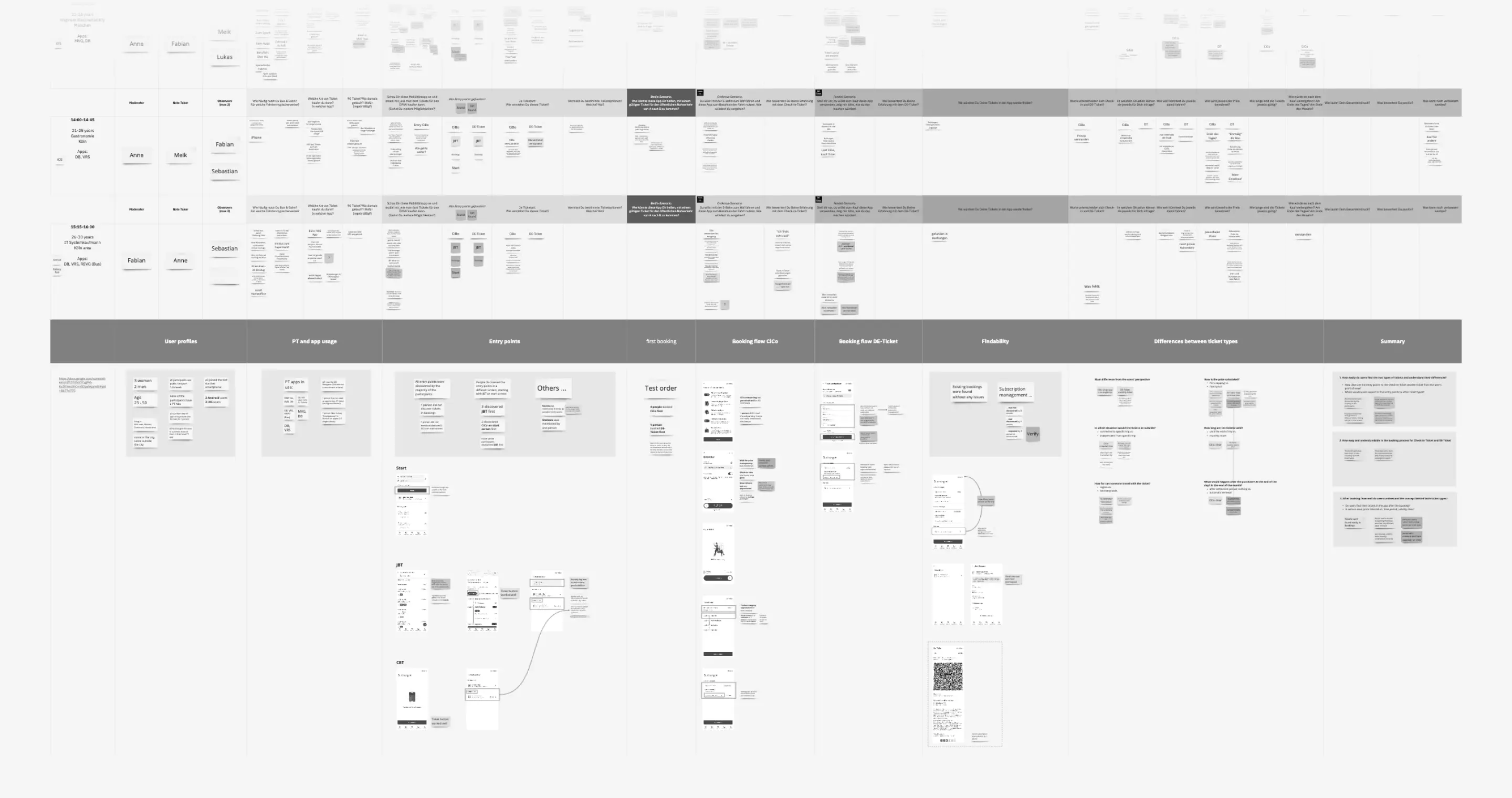
In a full-fledged solution, which provides a variety of transport methods, the challenges are much more complex. Which specific requirements can I meet while remaining generic? What are the limitations of our implementations due to third-party APIs? To shed light on interrelationships and generate meaningful insights, we have done a lot of research to ensure a seamless user experience even after booking.

Bookings
A variety of cards
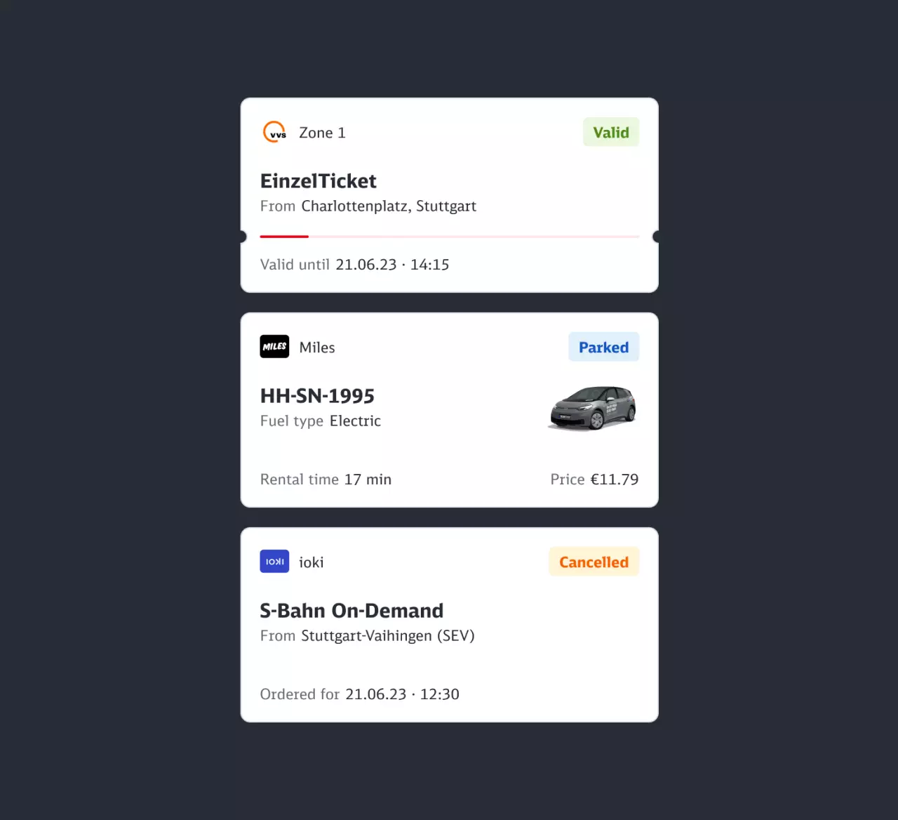
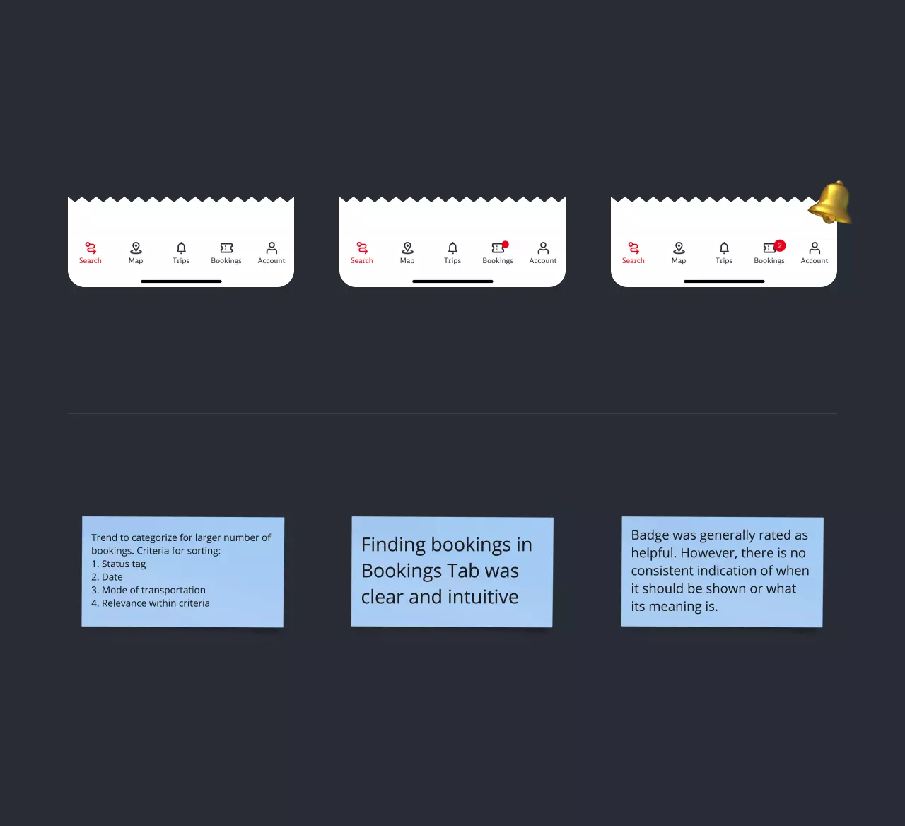
A wide range of transport options requires a variety of visualisation options in return. With the new Booking Cards, this has been ensured. While still being a generic component it allows to hold all kind of specific information such as expiration bars or price updates for rental vehicles. In discussions with users, we questioned the findability of the bookings made and determined valuable insights regarding ordering by card sorting. We also tried to find out whether notifications add value and for which updates a user expects them.

Subscriptions
Travelling throughout Germany
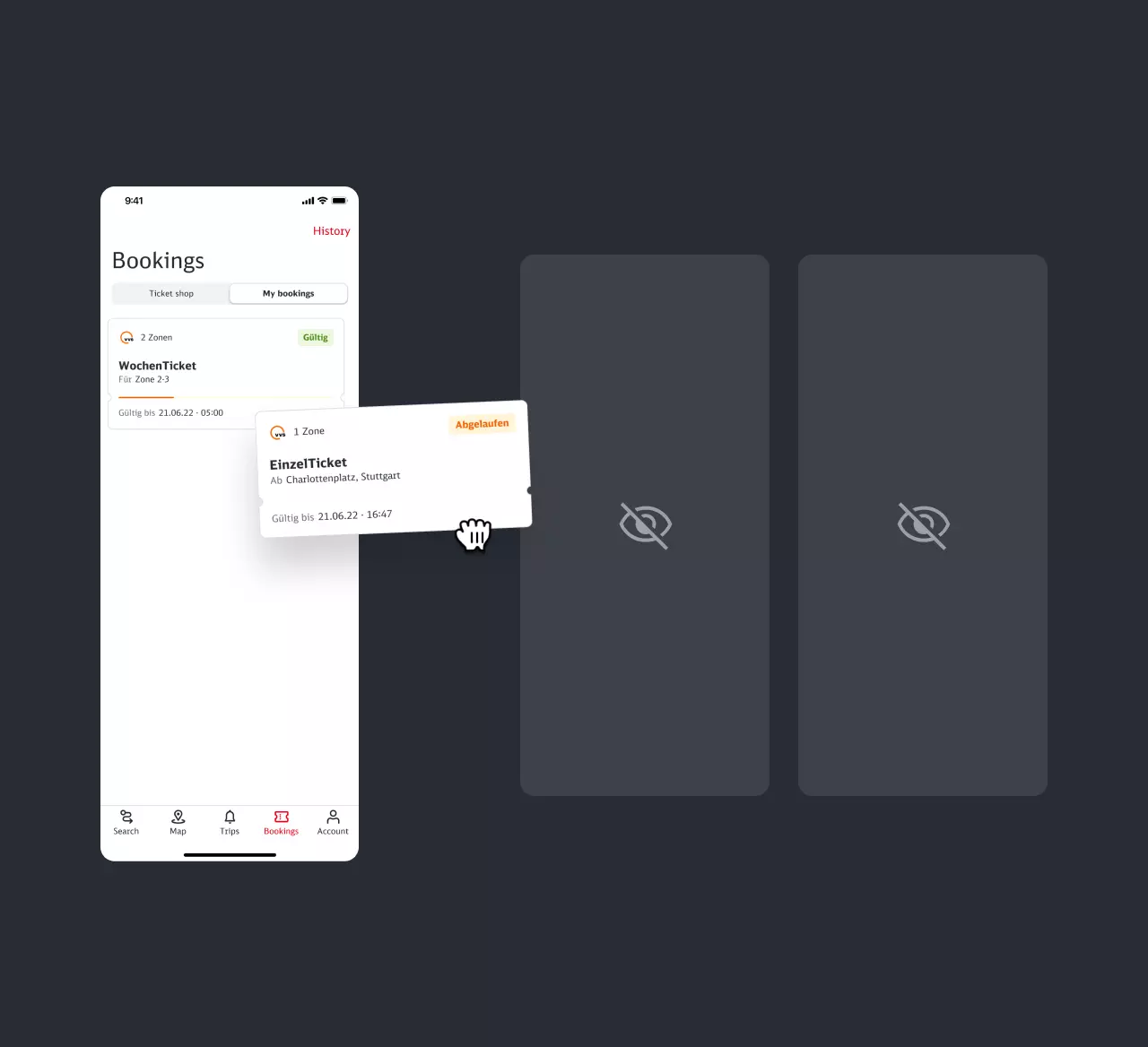
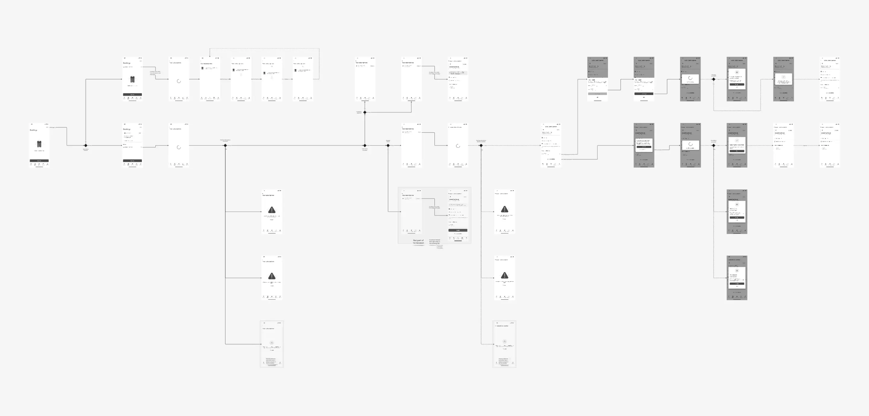
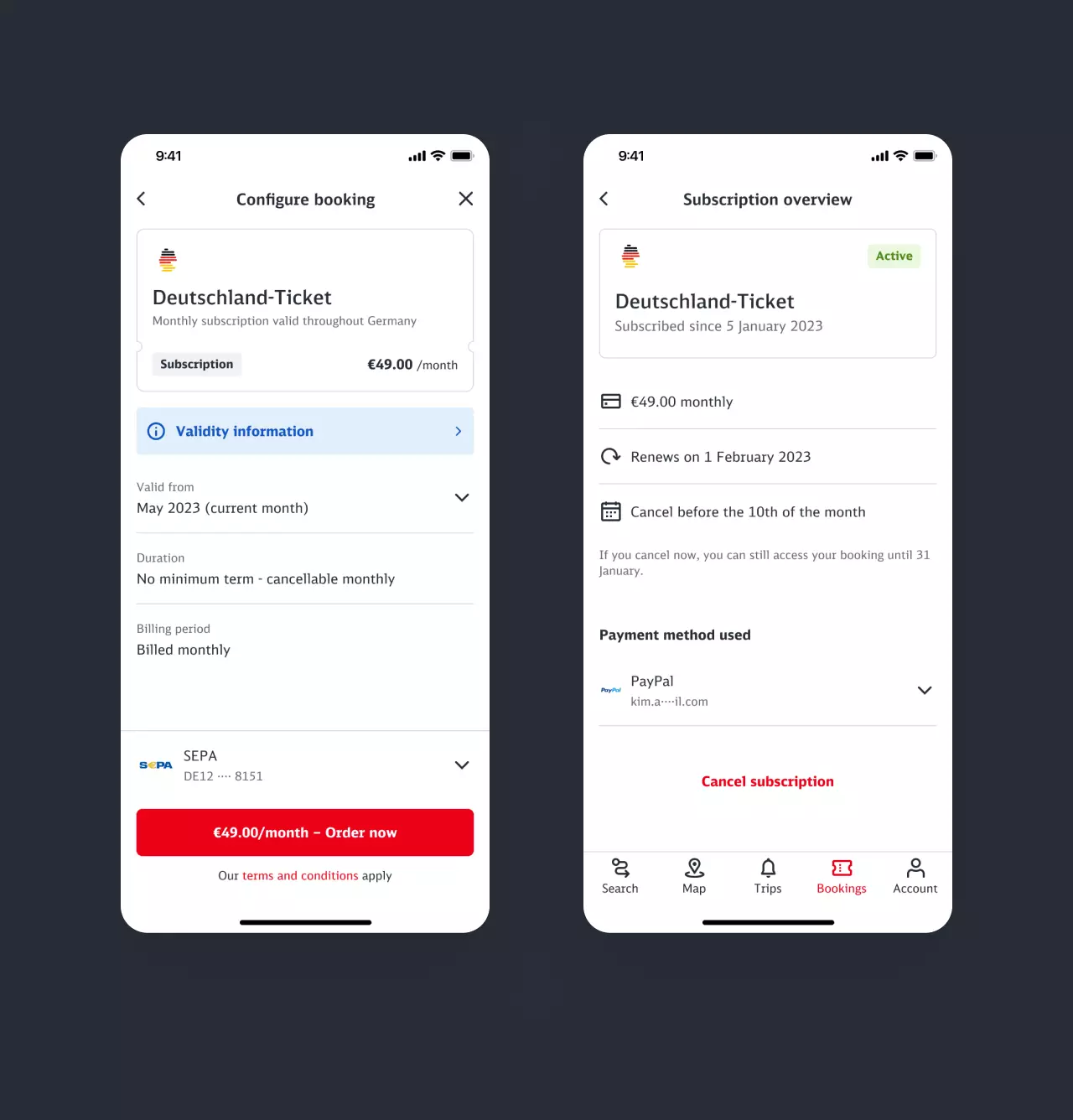
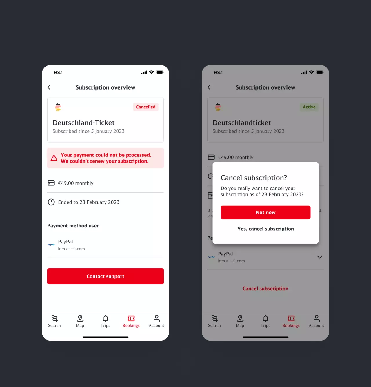
Even though I was initially only responsible for selling the Deutschland-Ticket, subscription management became a substantial part of the offer when it was introduced. So I also took on the management of subscriptions and designed a solution that could also work for sharing providers. As the subscription is currently bound to a full calendar month and certain conditions must be met when booking and cancelling, the drafting of the corresponding copies was a key challenge. After the introduction of the new subscription model, minor adjustments were made, for instance enabling the change of the payment method that is currently in use.
Booking history
Expenses at a glance
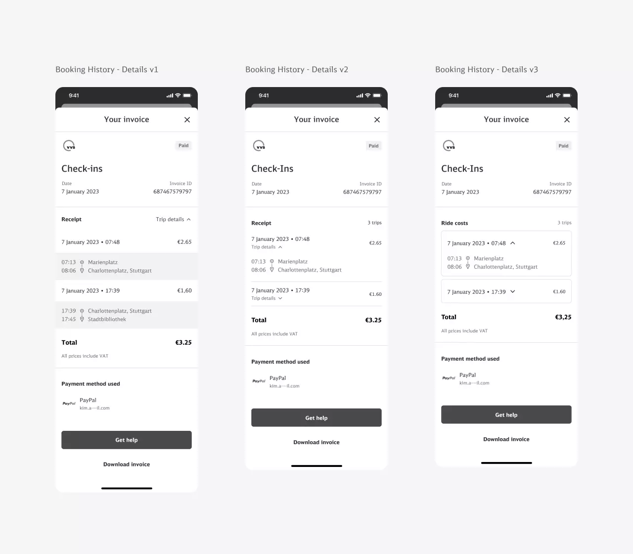
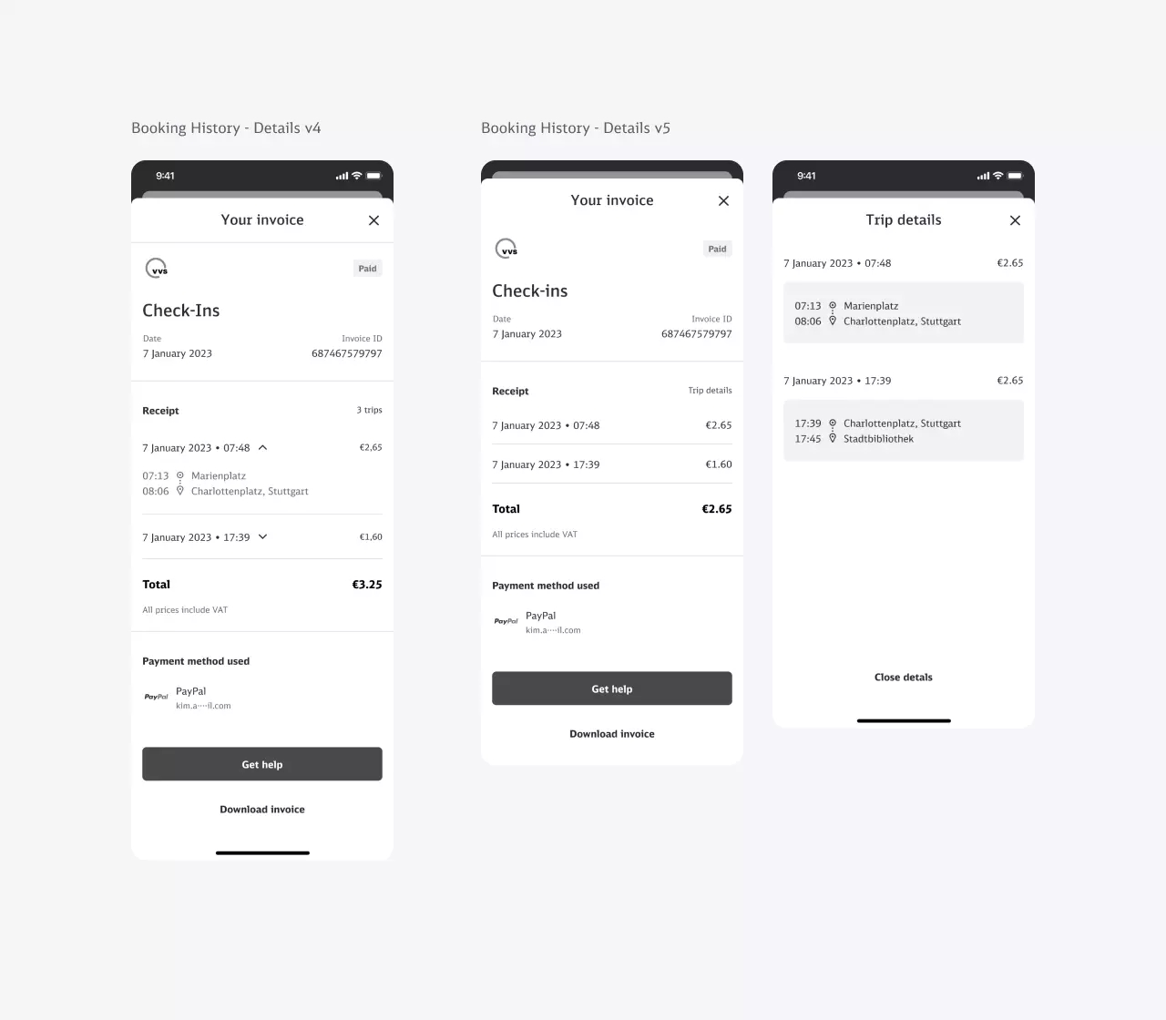
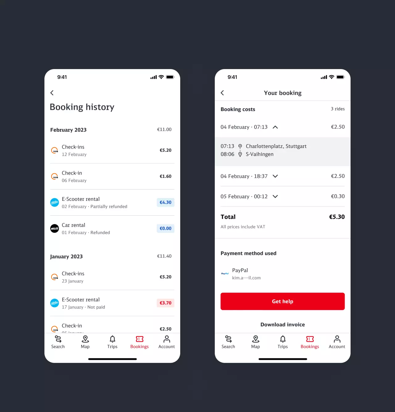
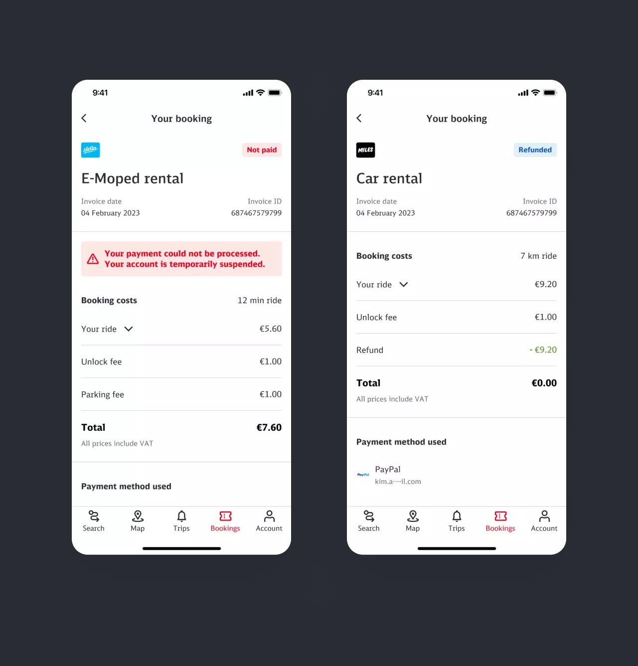
To ensure that users no longer have to rely solely on their e-mail inbox and can also view their mobility expenses within our platform, we implemented a booking history. This extension is particularly valuable for post-paid ticketing that comes with a daily best price. While having dependencies across teams we came up with a generic solution that allowed the same templates for single or multiple public transport trips, subscriptions, floating vehicles, and on-demand services. A particular challenge was the aggregation of several rides with the Check-In-Ticket within a single settlement period. We tested and reviewed several user interfaces to find a suitable visualisation that has clear interaction patterns from the user's point of view while ensuring consistency across the platform.
My contribution
Collaboration across teams
I enjoyed working on multiple interconnected features and ensuring a seamless user experience. As a UX/UI Designer, I took on a variety of tasks that came up. Testing various prototypes allowed us to gain valuable insights through user interviews and usability testing. Therefore I worked closely with stakeholders from various teams to refine and create a cohesive experience across all features. I played a key role in benchmarking, conceptualizing ideas, designing intuitive interfaces, and communicating between development and design. Additionally, I utilized my expertise in UX writing to craft clear and concise copies that guided users through each feature.
Next project
Scan and Go
Proceed
