Scan and Go
/21

Concept
UX
UI
Design System
Management
Illustration
Client
Budni · Edeka
Credits
Cellular AG
When
/21
What
Mobile app
The Corona pandemic has significantly changed consumer behaviour. To quickly keep up with the changing environment, a self-checkout service with Scan and Go has been integrated into existing apps to keep pace with the ever-increasing digitalisation and to respond to changing market shares.


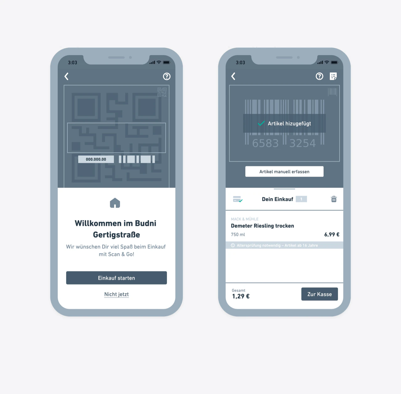
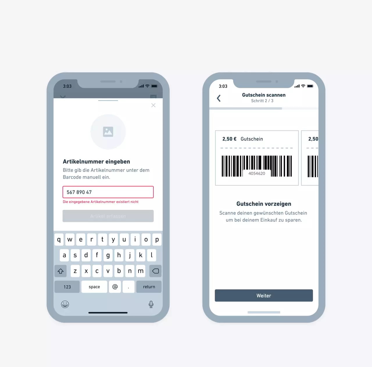
The situation
From migration to integration
Digital transformation is not just about leveraging new technologies. It is a cultural shift and a journey that many traditional FMCG brands must undertake to compete in a market that now sees more and more direct-to-consumer startups. Taking over the project I faced various challenges: Getting to know the client, conceptualizing and designing the feature, and doing it during a migration from Sketch to Figma.
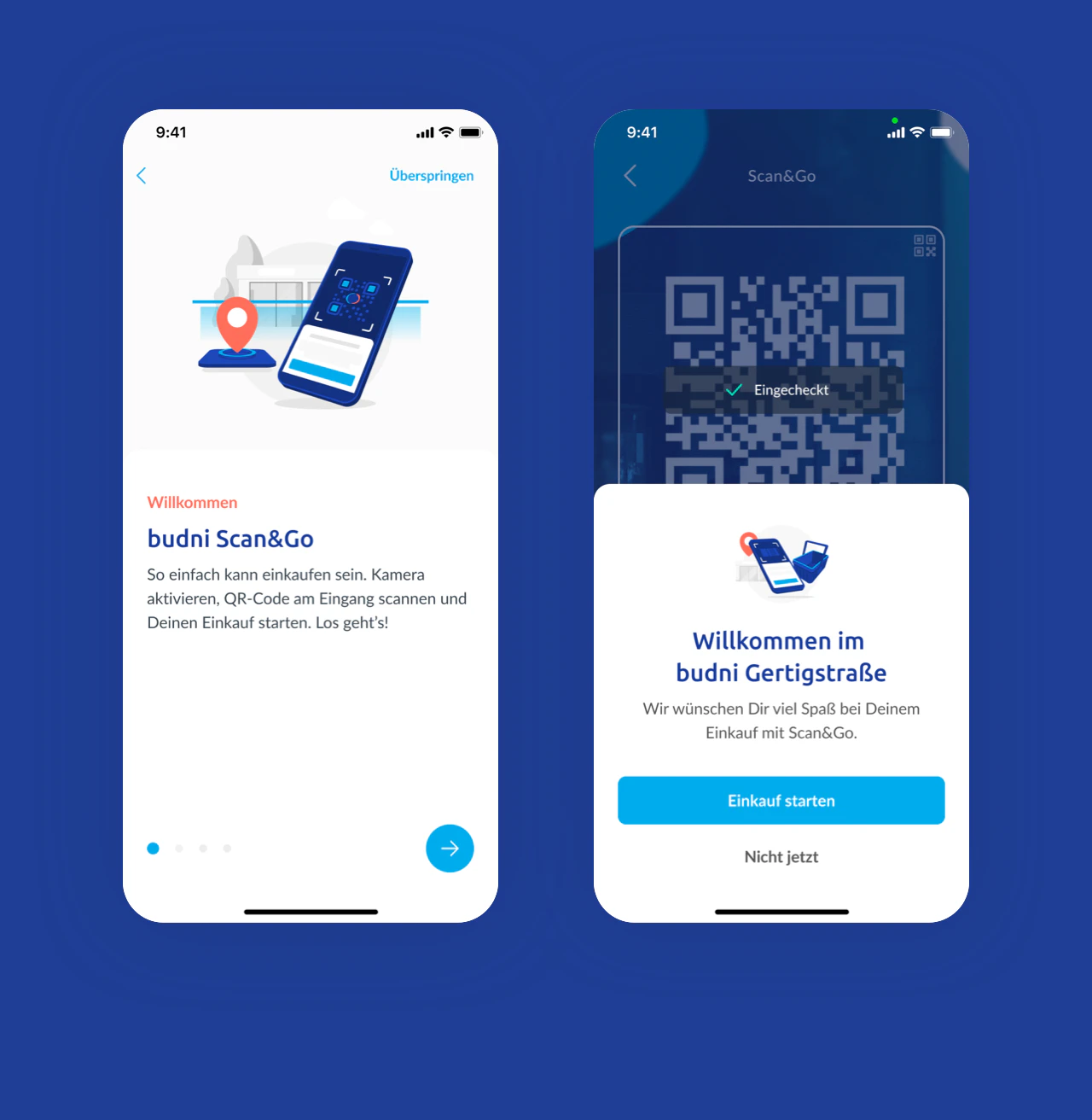
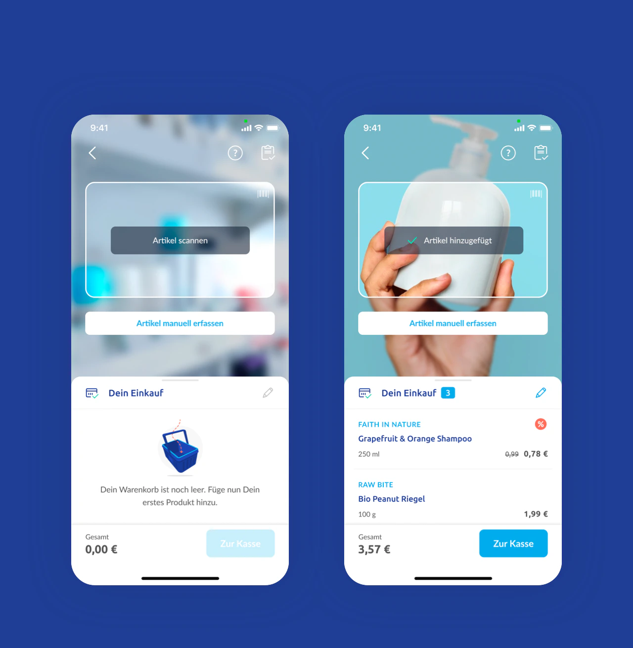
The solution
Shopping via check-in
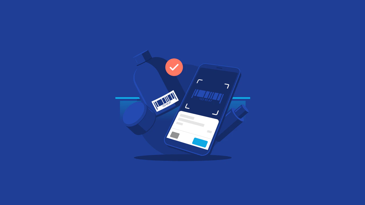
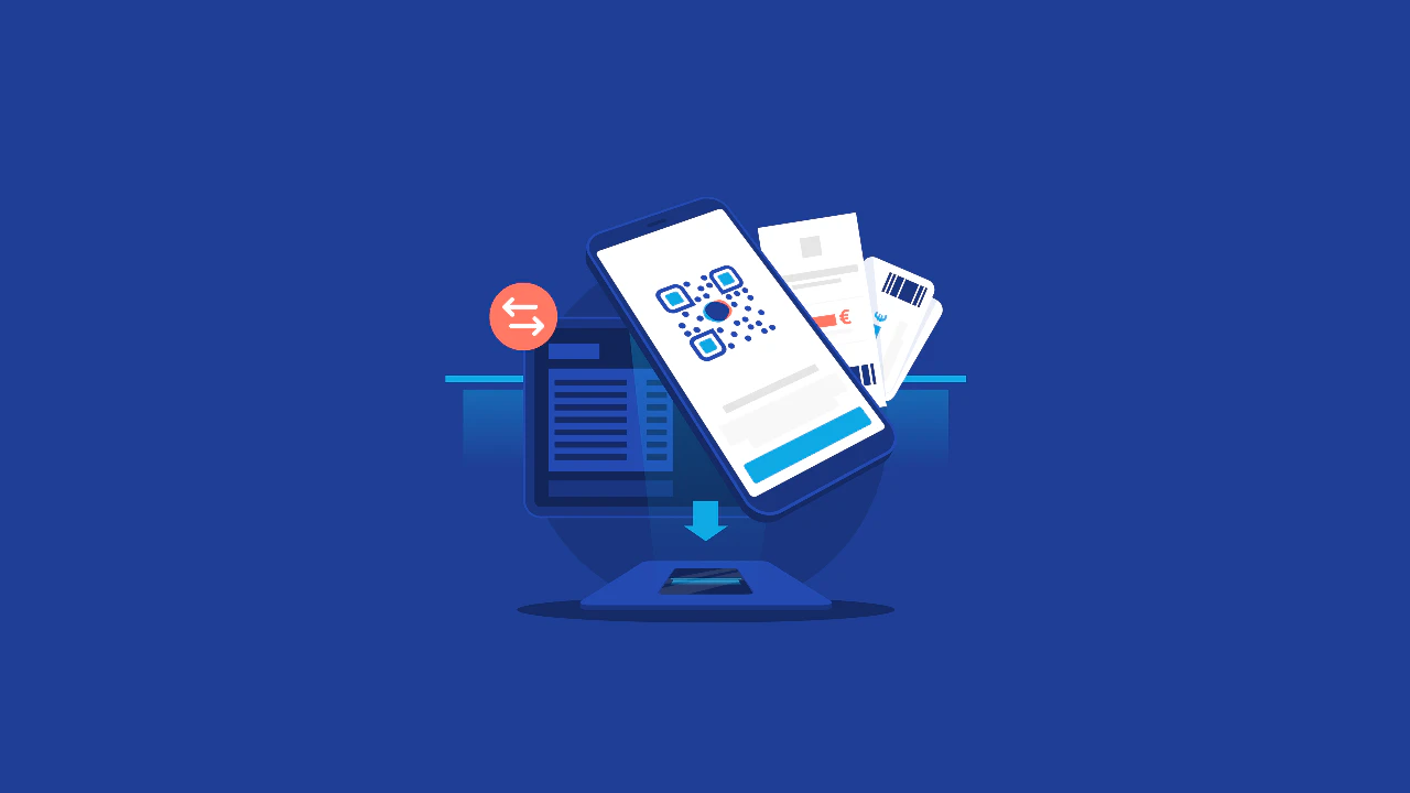
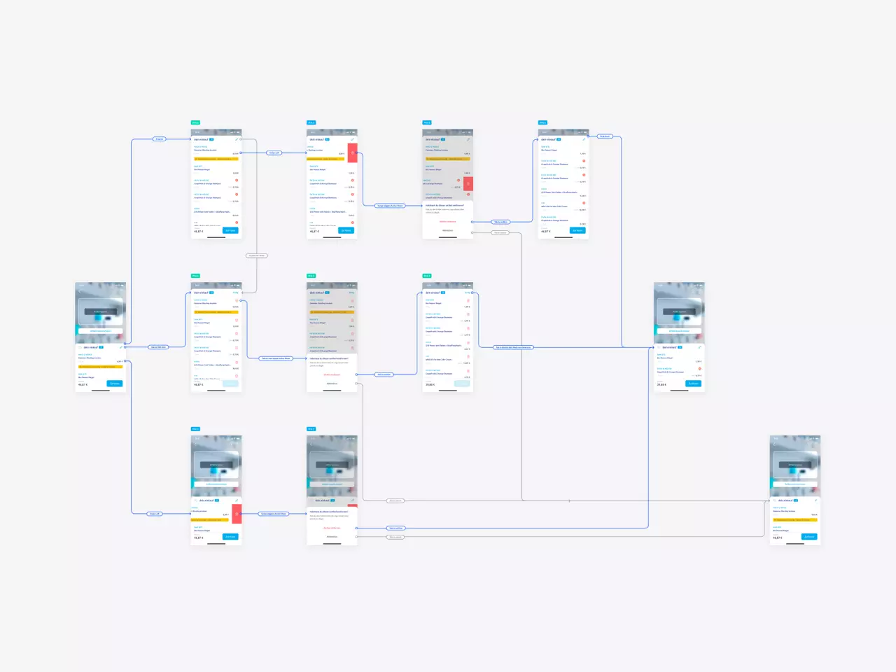
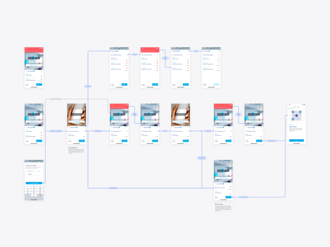
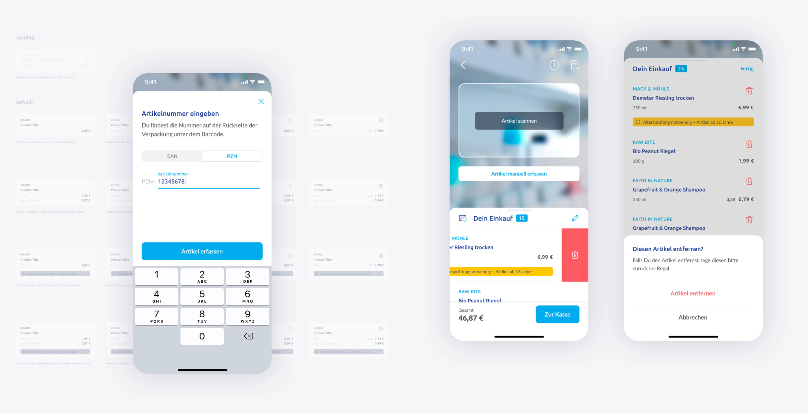
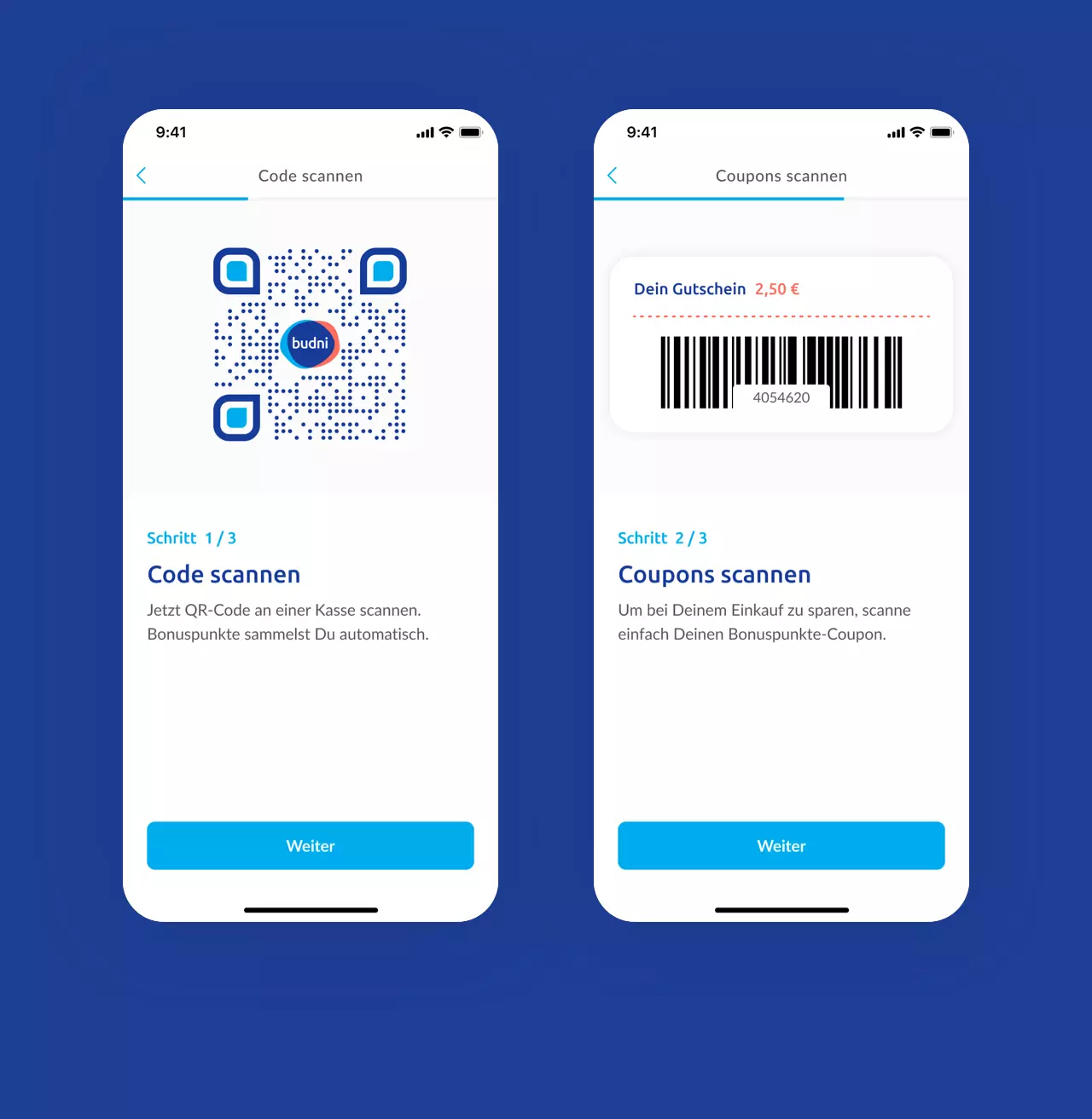
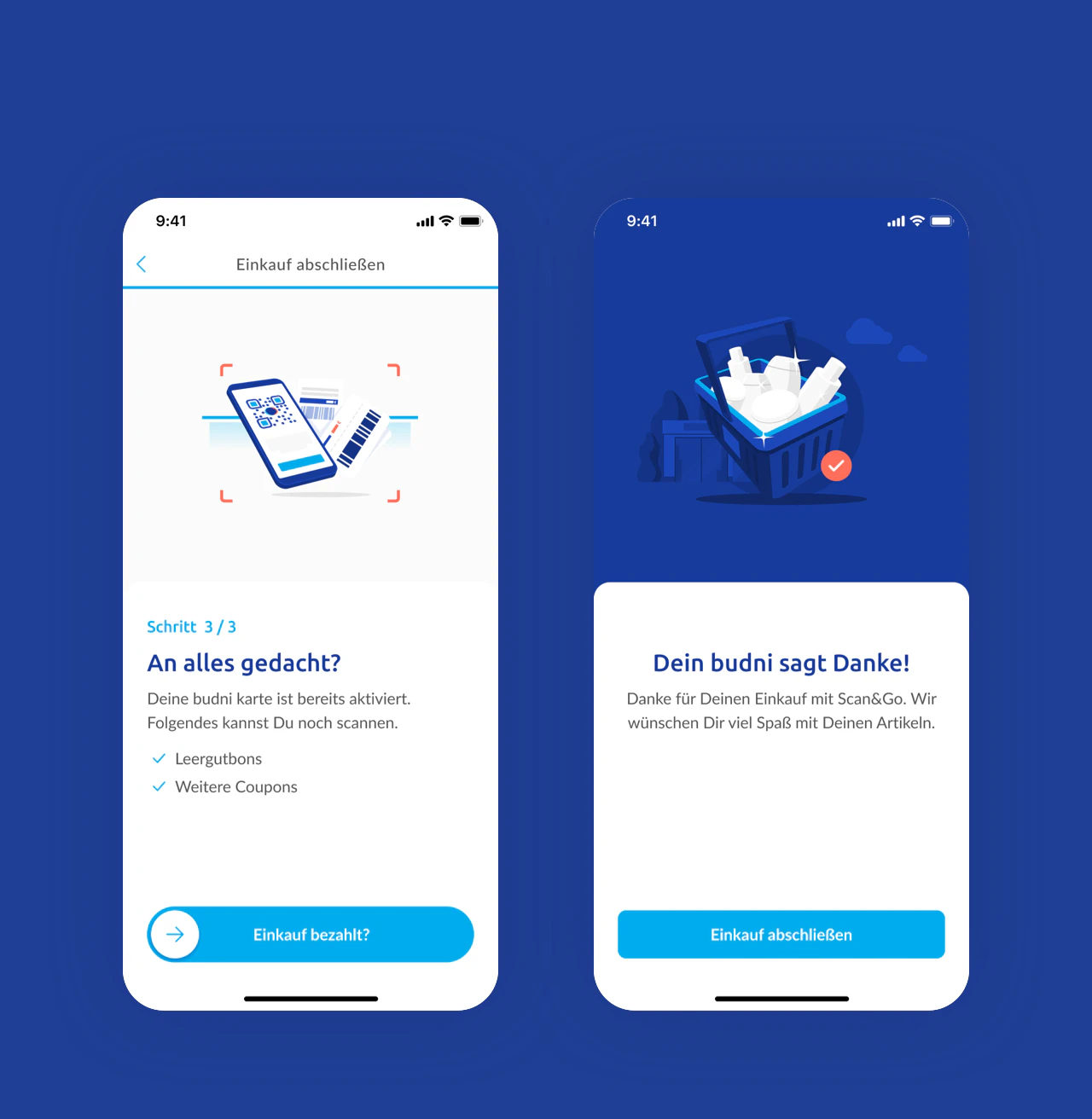
One of the biggest challenges was to create a proper entry point for the feature. A restructuring of the Tab Bar was the result. The scan of a QR-Code allows users to easily enter Scan and Go and at the same time ensures the selection of the correct retail store without having to select it manually. By using a split screen, users always have their shopping cart in view while scanning products. To complete the purchase, users generate their own QR-Code during checkout to easily transfer the scanned products of their cart to a self-scanning terminal.
My contribution
Accompanying the whole process
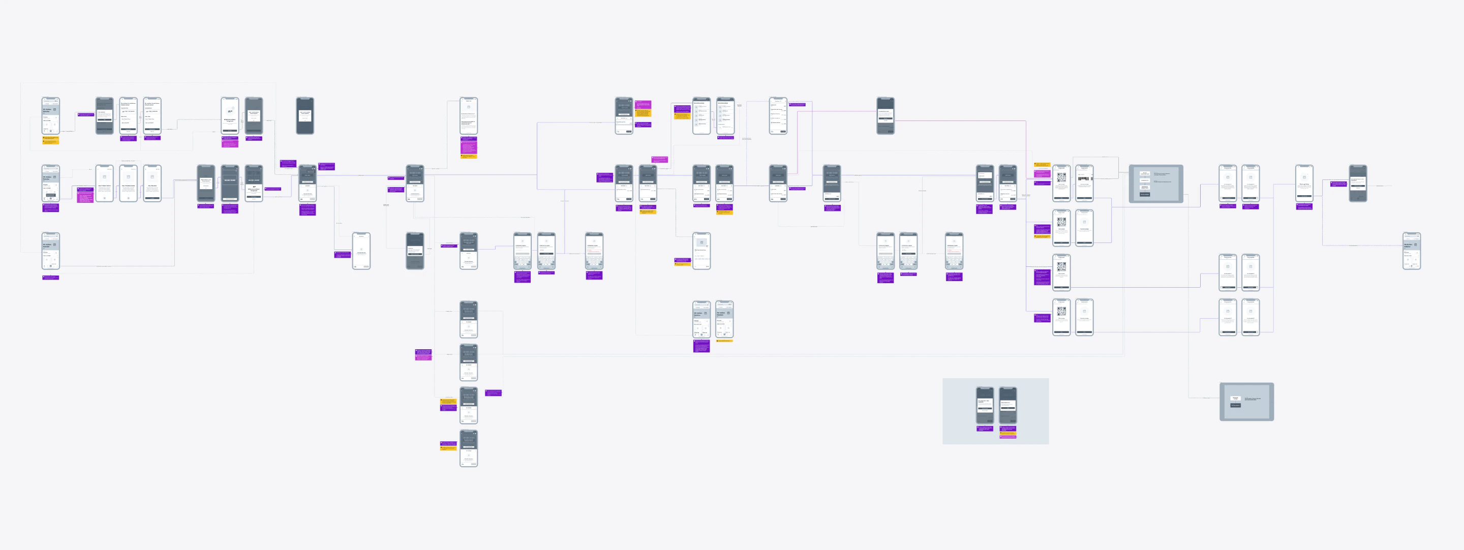
During the project, I was in charge of the entire process. This included first rough concepts, the entire UI/UX Design, Visual Design, Prototyping up to the handoff to the development. Furthermore, it was possible to transfer new and also a majority of the existing components into Figma and to lay a foundation for a Multi-Platform Design System with the newly created libraries. It was an exciting project that, with its newly created infrastructure, now has the possibility to scale better and meet the ever-changing demands of consumers.
Next project
Lightelligence
Proceed
